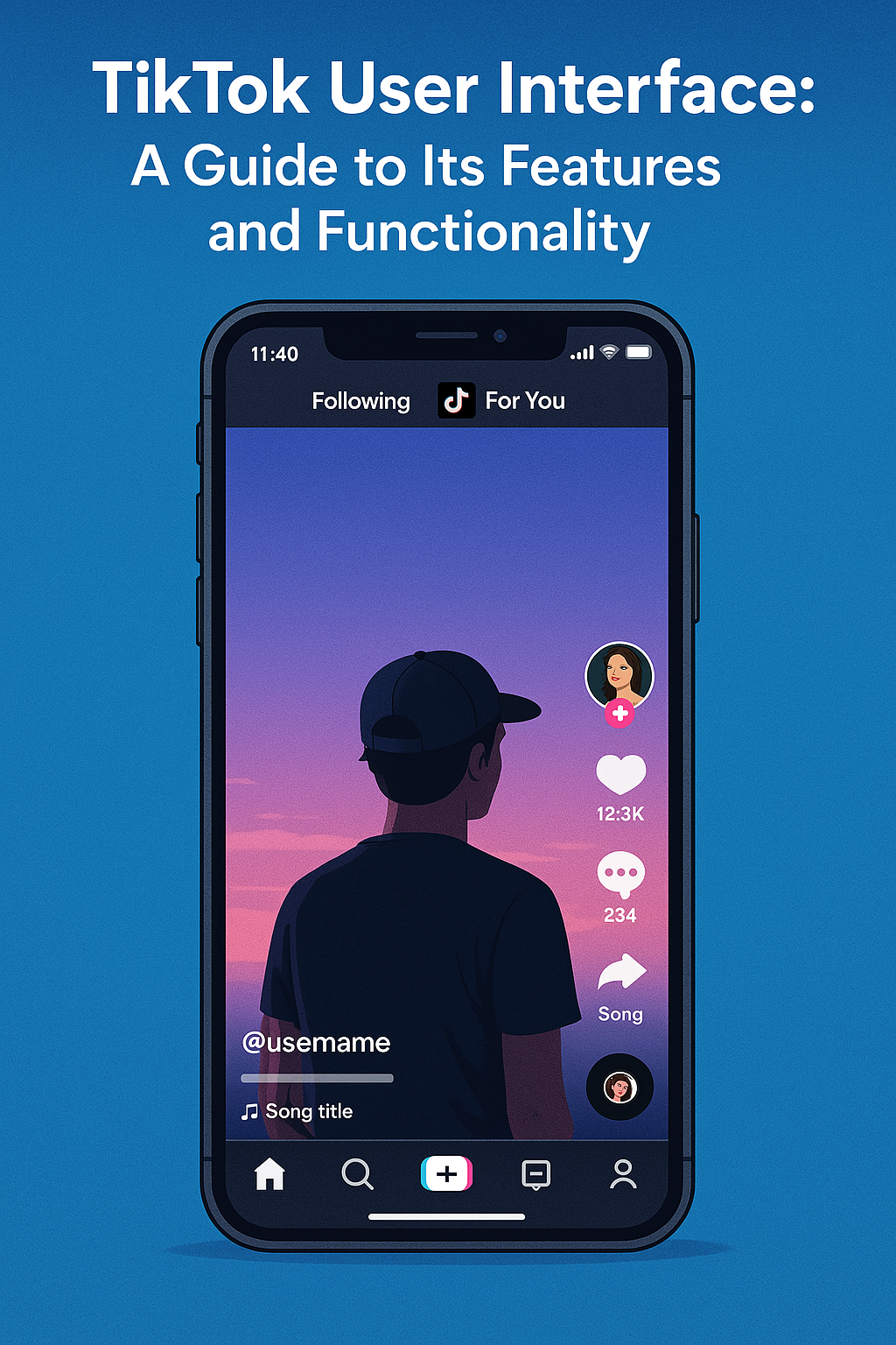
TikTok has taken the world, becoming one of the most popular social media apps in a few years. We surely can say that it’s a great success. But what was the part of this recipe that led to it. One thing for sure: it is largely due to its engaging and intuitive user interface. The app is designed to immerse users instantly. Everything is made so that it is easy to watch, to interact with, and to create short-form videos. TikTok’s UI balances simplicity with a wealth of different features. It caters both casual viewers and content creators.
Let’s explore the main elements of TikTok’s UI and see what makes it so user-friendly and addictive.

Key Components of the TikTok User Interface
- Home Feed (For You Page & Following)
- For You Page (FYP): This is the primary feed and one of TikTok’s signature features. It displays a curated stream of videos tailored to each user’s interests, using TikTok’s advanced recommendation algorithm.
- Following Tab: The “Following” tab is an alternative feed where users can view content specifically from accounts they follow.
- Swipe Navigation: Users can swipe up or down to move between videos, making it seamless to browse content quickly.
- Video Playback Screen
- Like, Comment, and Share Buttons: On the right side of each video, users will see options to like (heart icon), comment (speech bubble), and share (arrow icon). These buttons are prominently placed for easy access. Users are more likely to like a video, if there is already a good amount of likes displayed with the number below the heart. Growing more TikTok followers also helps to increase TikTok likes with ease.
- Profile Avatar: This appears on the right, just above the icons for engagement, allowing users to visit the profile of the video creator with one tap.
- Music and Sound Icon: The rotating record icon at the bottom right lets users see the song or sound used in the video, linking to other videos using the same audio.
- Captions and Hashtags: These appear at the bottom of the video, often accompanied by tags and hashtags that can link users to similar content.
- Discovery/Search
- Explore Page: Tapping the magnifying glass icon opens the “Discover” page, where users can search for content, trending hashtags, effects, and users.
- Search Bar: The search bar allows users to explore specific topics, trends, or user profiles.
- Trending Content: TikTok developers filled the discover page with current trending videos, hashtags, and challenges, inviting users to join in on viral trends.
- Create (Plus Button)
- Video Creation: The “+” icon at the center of the menu bar opens TikTok’s video creation interface, where users can shoot, edit, and post videos.
- Effects and Filters: Users can apply filters, effects, and AR tools, giving them creative options to customize videos.
- Music Library: TikTok offers an extensive library of songs and sounds that users can add to their videos.
- Editing Tools: Options for trimming, adjusting speed, adding text, and layering effects make it easy for users to create polished videos directly within the app.
- Inbox (Notifications)
- Notifications Feed: The Inbox icon provides updates about likes, comments, new followers, and mentions.
- Messages: This tab also includes direct messages from other users, making it easy to connect with friends and followers.
- Profile Page
- Profile Layout: Users can access their own profile by tapping on the profile icon. The layout is simple, with a profile picture, bio, and grid of published videos.
- Follower and Following Counts: Clearly displayed at the top, allowing users to keep track of their follower metrics.
- Favorites and Saved Videos: Users can save videos, sounds, effects, and hashtags to their favorites for easy access later.
Additional Noteworthy UI Elements
- Interactive Comments Section: The comment section is designed to be immersive, with a layout that enables users to view the video while reading or posting comments.
- Notifications Overlay: Notifications like new likes, comments, or messages are subtly displayed as pop-ups while browsing, allowing users to stay updated without leaving the feed.
- Dual Viewing Mode: TikTok’s interface supports full-screen portrait videos. This feature gives us an immersive viewing experience. It captures users’ full attention.
Why TikTok’s UI is So Effective
- Simplicity and Focus: TikTok’s UI is streamlined to make video discovery easy and engaging. The single-feed layout keeps users focused on one video at a time. This is the reason that enhances engagement in the app and prevents distraction from the rest of the real world.
- Seamless Interactivity: Placing all interaction buttons on one side of the screen ensures easy access. The swipe-based navigation between videos also adds to the smooth and effortless browsing experience.
- Personalization: With its highly personalized FYP, TikTok’s UI continuously serves content relevant to each user, maximizing time spent on the app.
- Encouragement of User-Generated Content: TikTok’s UI makes content creation accessible to everyone. There are lots of various effects, filters, and sounds readily available. This encourages users to try their hand at creating videos. And this leads to contributing to TikTok’s ever-growing sea of content.
Conclusion
TikTok’s user interface is a masterclass that we should take lessons from. The mix of intuitive design, blending user-friendliness with a host of other useful features makes this app a one of a kind. By making both content discovery and creation as seamless as possible, TikTok has created an experience so addictive that it keeps some users on the verge of true addiction. TikTok’s UI empowers users to consume and create content effortlessly. This is the set of the standard for what a modern social media platform can achieve.