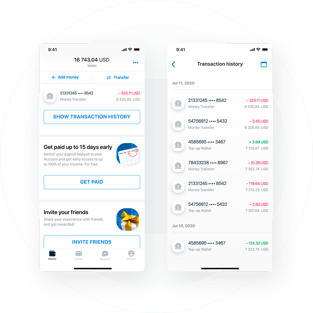
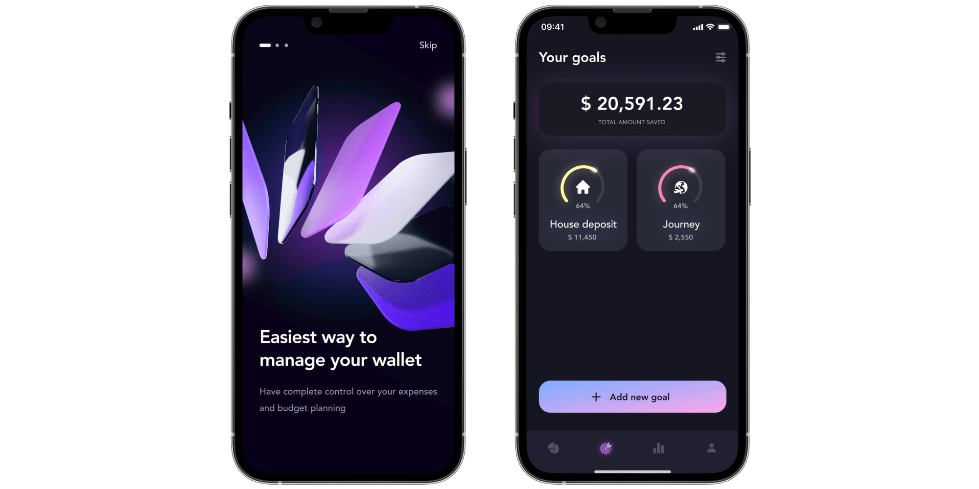
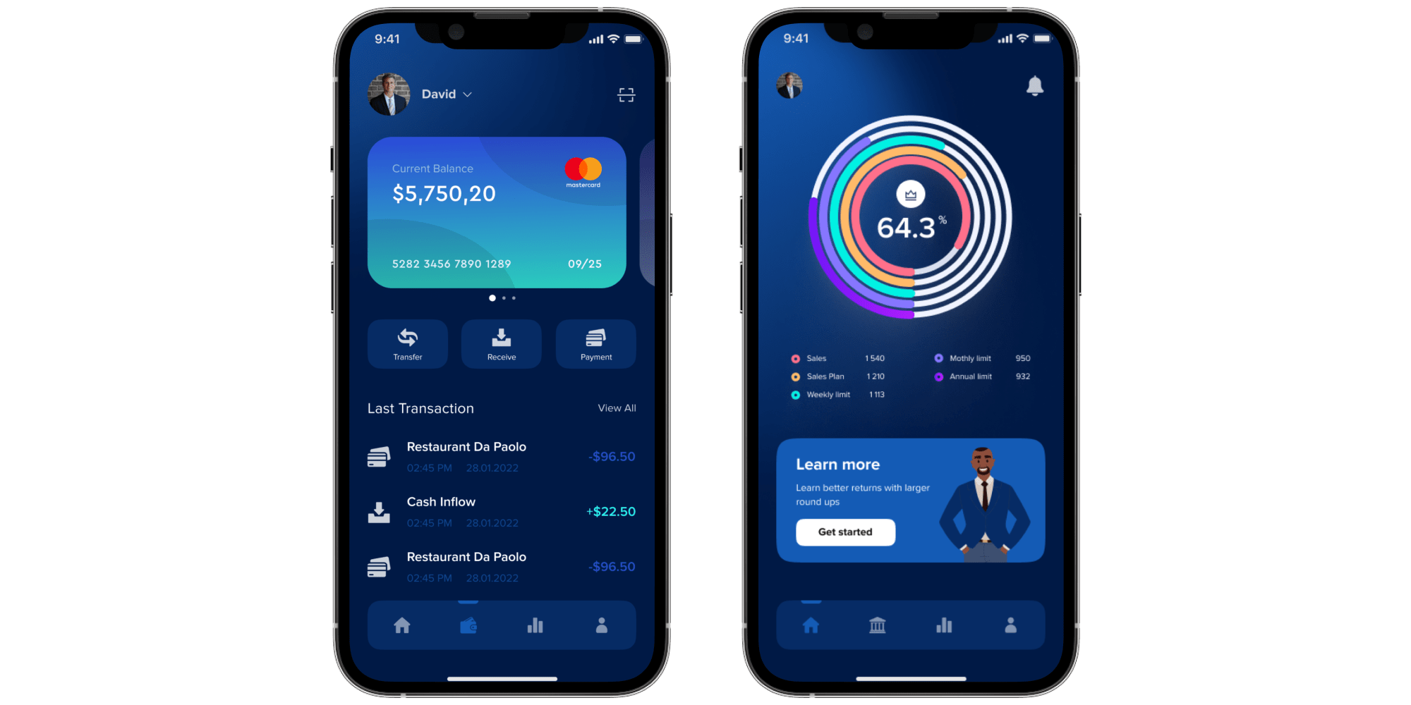
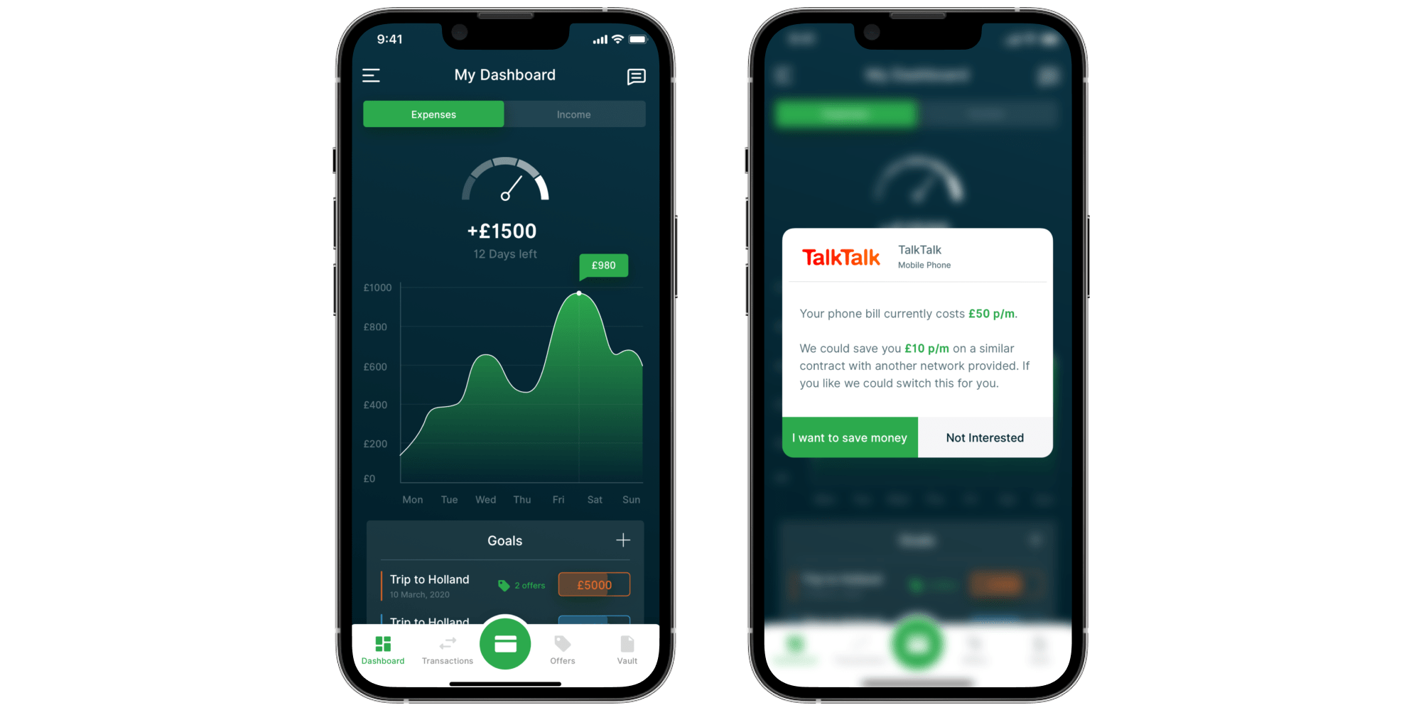
Design for Mobile Banking App for Migrants
Itexus was assigned to craft a neobank solution intended to serve the needs of a certain US banks’ audience segment – migrants. The app was expected to facilitate monetary transactions like financial help to families, getting paychecks early, microloans, etc.
Developing a fintech solution implies addressing certain design challenges owing to the industry specifics. In this case study, we cover the design phase of the solution development.
In a highly competitive domain like fintech, one of the key factors allowing companies to stay on top is proper UI design. Its importance cannot be overstated, as it directly affects the user experience, which is a major driver for the success of trading solutions in the market. That’s why it’s crucial to pay proper attention to the design of your app’s user interface.
• Build product identity
Product identity is crucial in the market, where competition for new users can be fierce. It not only compels people to try a new product but also influences them to stay loyal to a company longer. As UI design has become more closely linked with product identity, companies are using videos and GIFs to showcase their products’ unique features. So if you’re going to use MOV format make sure that it’s been converted into MP4 or GIF before uploading.
• Introduce simplicity by creating a clear user flow
Finance, in general, and trading, in particular, can be very complex for the average user. However, a well-thought-out UI design can simplify everything and make things as clear as possible for users. This can help them complete their tasks on the go and develop a fondness for your app.
• Enable users to make better decisions faster
Data-driven decisions lead to better outcomes. By presenting information in an easily understandable format, users are provided with actionable insights about their finances. This enables them to make more rational decisions and achieve their financial goals, ultimately resulting in higher user satisfaction scores.
One of the most widely recognized solutions for superior user experience and excellent UI design is the Robinhood trading app. Robinhood UI design stands out from all other trading apps on the market, with users highlighting its convenience, high usability, and interactivity. In this article, we will explore what makes Robinhood unique among its competitors and identify best practices used in its interface that you can incorporate to create a vibrant and eye-catching UI for your trading app, delighting your users.
Robinhood UI explained: 3 secrets from the app
The central focus of Robinhood’s UI and design approach is to present customers with the most relevant and useful information as clearly as possible. This enables them to make informed decisions about managing their assets. For years, financial service firms, including brokers and digital platforms, have erected barriers for users with cluttered, poorly designed solutions. Robinhood takes a different approach. Their goal is to simplify access to investments for participants in the U.S. financial system. They achieve this with a clean, spotless user interface on their app.
To truly appreciate the app’s design brilliance, let’s examine some of its achievements. In 2015, shortly after its release, the iOS app won the prestigious Apple Design Award for its clean, content-centric design. A year later, in 2016, Robinhood UI won another trophy – the Google Play Award for Best Use of Material Design. It’s rare for fintech apps to receive such broad recognition for their design achievements. That’s why the Robinhood app design deserves special attention. Keep reading to discover more about the Robinhood app UI tricks.
1. Put your users in the center of everything
The customer-centric, design-first approach has made Robinhood a preferred tool for a generation of mobile-first customers eager to invest. Therefore, the first lesson in Robinhood’s UI design is to put your users at the center of everything. To win users’ love, your app needs to be friendly and welcoming, rather than intimidating or condescending. Of course, the text is important, but there’s more to the user experience than just words. Robinhood design plays a critical role in creating an overall experience around the product, so make sure it conveys the intended message effectively.
2. Focus on simplicity
Fintech companies that aim to win user loyalty should prioritize accessible, user-friendly, and informative user interfaces. The days of complicated and confusing interfaces are in the past. While it’s natural to want to introduce new features over time, consistency and a simple design approach are key to ensuring your app remains user-friendly and informative.
3. Communicate clearly
Push notifications are a great tool for increasing user retention and engagement, and boosting conversion rates. However, they can often be annoying and useless. Robinhood’s product designers recognize that notifications meant to drive engagement can create artificial barriers between an app and its users. Instead, they have enabled only informational notifications that keep users up to date on their transactions or inform them of important account activity. Furthermore, the notifications contain all the necessary information, so users do not even have to launch the app to find out more. This is what true concern for users looks like.
Trading app design best practices
Now that the Robinhood UI/UX has been explained and you know what sets it apart from other investment solutions, let’s explore the best practices for trading app design.
Intuitiveness and simplicity
The main idea is to help users complete tasks effortlessly within the app. They should only need to learn how the app works once and be able to apply that knowledge in different contexts, without having to learn new workflows each time. Therefore, the interface should be clutter-free and devoid of any unnecessary information that might distract users from their primary goals. This is referred to as an intuitive UI. An intuitive UI increases adoption rates as users can quickly grasp app functionality without having to go through complicated manuals or instructions.
Gamification
Gamification can increase engagement by introducing an entertaining element and encouraging users to take desired actions. However, it is important to strike a balance and avoid overloading your trading app with gamification features, as financial matters should be taken seriously.
Functional animation
Functional animation refers to subtle animations that are integrated into the user interface as part of its functionality. In user-centered design, where the focus is on people, the UI should be intuitive, responsive, and human. This is where functional animation can be useful. It enhances the design of the user interface, guides users through the app, reduces cognitive load, and prevents users from overlooking changes.
Micro-interactions
Microinteractions have a single purpose: to delight the user and create an engaging, welcoming atmosphere by providing feedback on user actions. Although these design elements are tiny, it’s the attention to detail that distinguishes an ordinary design from an extraordinary one, ultimately making users delighted with your app.
Data and information visualization
The art of visualization is to present data in a way that makes it easy to understand and work with. Data visualization transforms raw numbers into easily digestible information, which brings value to users. When data is presented in the form of charts and graphs, complex information becomes easy to interpret, and users gain more actionable insights into their finances.
Accessibility and inclusivity
Accessibility and inclusivity are essential considerations to ensure that your app is usable by all individuals, including those with disabilities or special needs. By embracing accessibility and inclusivity, you demonstrate your commitment to providing equal opportunities for all users. Additionally, you expand your app’s reach to a more diverse and engaged audience. Consulting with a digital accessibility consultant can help identify potential barriers and ensure compliance with accessibility standards. Take into consideration important aspects such as font size, color contrast, and compatibility with assistive technologies. It is recommended that you use the principles of accessibility standards, such as the Web Content Accessibility Guidelines (WCAG), in your design.
3 reasons to entrust the design of your trading application to Itexus
✅ Design thinking as a strategy for innovation
All of our processes are based on the concept of design thinking. We conduct thorough research on your target audience to understand their needs and pain points. Then, we redefine problems and develop innovative, responsive, and user-friendly solutions that ensure a great user experience.
✅ Years of experience in designing apps for fintechs
Since 2013, we have been developing our skills in designing user interfaces and experiences. We have gained expertise in fintech design and look forward to sharing our knowledge with you. Our team can deliver top-notch design concepts, prototypes, graphics, and visual elements to create engaging, intuitive, and user-friendly apps. Check out our fintech design portfolio to see our work.
✅ Flexible and customer-centric approach
We strive to create and deliver better, unique experiences for our clients, just as we help them do for their users. Our approach places you at the center of everything: we align every step with your needs, goals, and expectations. This leads to smooth interactions and great results.
Summary
When it comes to fintech design, there are multiple nuances to consider if you want your app to resonate with users. It should be simple yet visually appealing, engaging yet balanced, and not overloaded with gamification. A single mistake can ruin the entire project’s success. Therefore, it is advisable to entrust the design of a trading app, a sensitive matter, to experts.
At Itexus, we have developed and designed applications for fintechs of all sizes around the world, accumulating a wealth of knowledge along the way. We are excited to apply this knowledge, along with best practices, to create a consistent and engaging user interface (UI) that will make your trading application stand out and earn the love and loyalty of its users. Contact our design team to learn how Itexus can benefit your project.
Liked the article? Rate us
Average rating: 0 (0 votes)