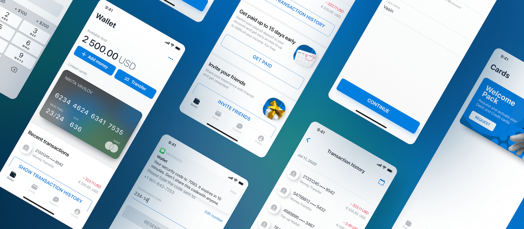
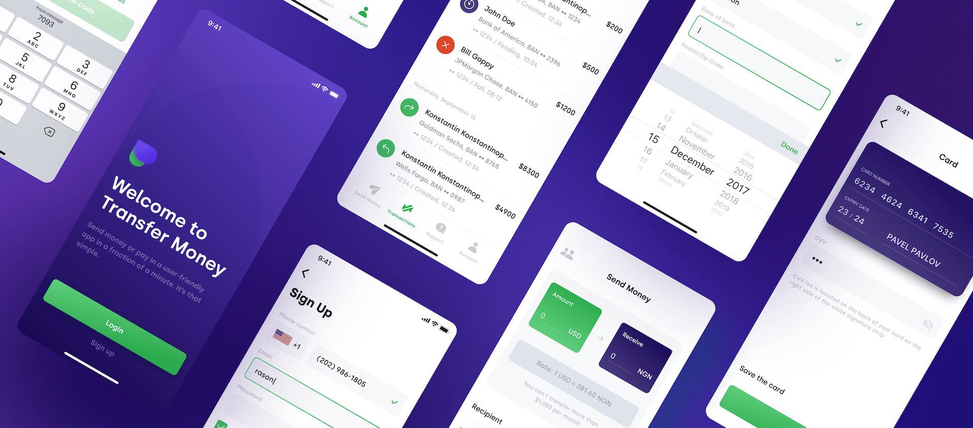
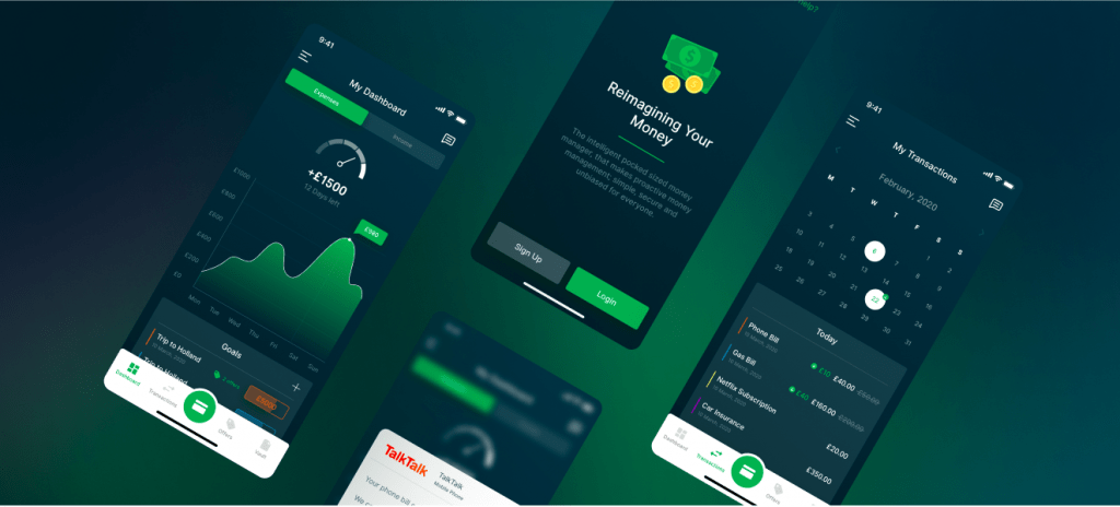
According to a recent report by Statista, the six app-only digital banks (NeoBanks) had a combined total of over 40 million iOS and Android app downloads in 2021. It is also predicted that the number of neobanks users will reach 318.72 million by 2026. The lion’s share of the success of these apps can be attributed to their convenience and their focus on user needs. Indeed, in its recent report on digital banking, Deloitte identified eight segment-specific needs ignored by traditional banks and more than 40 features of neobanks that meet those needs.
However, the popularity of neobanks is also strongly influenced by excellent mobile banking UI design. In this article, we talk about best practices and top trends in banking app UX /UI and explore the neobank app design process step by step.
Banking UI/UX Design Best Practices
The key point to keep in mind when designing your neobank app is making the product easy to use. This refers to the term of intuitive design.
Intuitive design reduces the cognitive load for your users and helps them get things done faster. To make an intuitive mobile banking design, you should keep some principles in mind:
✔️ Keep it simple and consistent
Don’t overload your app with dozens of options and buttons. Great UX is when users can complete their tasks with as little input as possible.
Another key to success is consistency in visual elements (like theme and color) and features. Consistent design is intuitive design. Banking app UI that lacks consistency runs the risk of alienating users, as it usually leads to uncertainty and confusion. And conversely, if your design is consistent, users can transfer their knowledge to new contexts and focus on performing the task rather than learning how the product UI works with each context change.

✔️ Make it readable
All text in the app needs to be clear and easy to read, so pay attention to fonts and spacing. If you work on an international mobile banking app UI design, make sure the font family supports characters in other languages. The readable font size starts at 16 pixels (or 11 points). Anything smaller can cause reading difficulties and result in poor UX. Also, make sure that the spacing is correct.
Buttons are another aspect that has a great impact on UX. Large-sized buttons that dominate the screen take up a lot of space and badly affect the readability of your app. On the other hand, buttons that are too small are hard to tap and lead to incorrect inputs, frustrating the user.
✔️ Opt for cards instead of lists
Long lists of services and products can discourage your users and lead to clutter. Therefore, if you categorize features and services and present them in the form of cards, it will be easier to use the app. The menu or dashboard looks more attractive and facilitates navigation.

✔️ Add gamification
For sure, money is a serious matter, but that doesn’t mean your neobank UI has to be boring. Integrating gamification features is the best way to increase user engagement with an app, make personal finance less stressful, and encourage healthy financial behavior among users. However, be careful to maintain a balance so that gamification does not distract users too much.
✔️ Provide vertical scrolling and progressive disclosure
Due to their specifics, mobile banking apps can be overloaded with data. If the UX/UI is not done right, even logging into a banking app to check your finances can quickly lead to information overload. A good way to make a user journey simpler and smoother is to present information in small segments. This practice is based on how the human brain works – when information is presented in small segments, it’s easier for the brain to process it. This technique, also known as Progressive Disclosure, ensures that your users aren’t overwhelmed by a sudden flood of information.
✔️ Show statistics on landing pages
A good practice is to give users instant access to screens that provide insights into their finances. These are, for example, statistics about spending habits, debt settlement records, and savings.

✔️ Introduce maps
It’s convenient to see the nearest ATMs right in the application instead of having to search for them on Google. Also, maps can be used to enable users to mark the places where they have made their last spending.
✔️ Enable push notifications
This is a tricky one because no one wants to be bombarded with a flood of notifications. However, if they are personalized, they can be helpful. Such notifications keep users up to date with the information that is relevant to them. Allow your users to choose what they want to be notified about, such as auto payments made, account top up, credit score or loan application updates, etc.
Click here to find more designs for FinTech solutions by Itexus.
Mobile Banking App UI/UX Design Steps
In this section, we’ll talk about how to create bank app UI design that delivers a great digital customer experience. By following these steps, you can avoid issues like rework and budget overruns.
Step 1. Determine the needs of your customers
First, find out who your target users are and what problems they have. To do this, answer the following questions:
- What are the main tasks they do with your app?
- What is the easiest way for your users to achieve their goals using the app?
- Is there a way to simplify user interaction with your app?
Such an approach enables a deeper understanding of your target audience and provides actionable insights into their needs and expectations – you can use this knowledge when designing the interface to make the app as relevant as possible for users.
Step 2. Create user scenarios and convert them into user flows
After defining your target users and their pain points, it’s time to design scenarios of possible interactions with your app and create user flows for them.
A user flow is a diagram or map that allows you to set the right sequence for the main user scenarios. It helps you design the actions users need to take to achieve their goals in each task.
Step 3. Create sitemaps
Once the main scenarios in which users will interact with your banking app are identified, it’s time to group all the design components and create a sitemap. The difference between a user flow and a sitemap is that the former shows the path of each scenario separately, while the sitemap gives you a view of the overall hierarchy of your app. It helps structure your app’s navigation and establish the right relationships between pages to ensure a smooth user experience.
Step 4. Create wireframes and a prototype
This stage is about creating a visual construction of the screens and content, taking into account the logic of the financial service.
Designers create wireframes for each screen individually on paper or using special programs such as Balsamiq or Figma. Wireframes are black and white layouts that schematically show where important elements are located in the final product.
The next step is to create a prototype. This is an interactive version of your banking application. A prototype is usually more detailed than wireframes, demonstrates functionality, and includes fonts, colors, and other graphic elements that represent the final look of the product.
Step 5. Design UI
It’s important not to confuse UX wireframing and prototyping with UI design. UX research, wireframing, and prototyping are all about how the app works. Bank UI design is about how the app looks. After your UX has been tested and optimized, you move into the UI design stage, where you sketch out design concepts, color schemes, shapes, fonts, buttons, font size, images, forms, illustrations (illustrations are graphics that convey information), animations (animations are changes in an image over time), etc. You also need to test several designs to see what works best for your users.
Step 6. Test the UX/UI
The final phase is A/B testing. It involves testing different concepts with groups of users and choosing the option that best meets the users’ needs. The design team randomly creates user groups, each of which receives a different app design. The differences in design can be superficial, such as button colors or fonts, or more fundamental.
For example, you can test different ways of visualizing data: bar charts or pie charts. Using A/B testing, you can find out which approach is more pleasant and convenient for your target users and ensure their satisfaction with your product.
Summary
It was not long ago that customers chose their bank based on branch location and ATM accessibility. Now mobile banking has arrived, and one of the most important ways to stand out from the crowd and gain popularity is to have a unique mobile banking design. This is exactly what we are great at.
The Itexus team designs stunning and user-friendly interfaces for financial services companies. We create boutique designs that strike a chord with users and lead to higher conversion rates, a great user experience, and increased revenue for your business. To go beyond the ordinary and help our clients gain market advantage, we leverage deep expertise, a user-centric approach, and modern technologies. Contact us if you want to be proud of the digital experience your customers have with your neobank.