Design for Mobile Banking App for Migrants
Leverage Itexus profound expertise to create a strong design solution for your business


Description
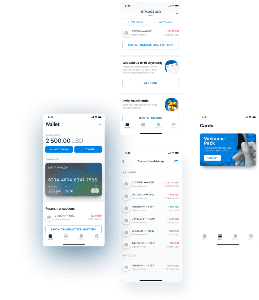
Itexus was assigned to craft a neobank solution intended to serve the needs of a certain US banks’ audience segment – migrants. The app was expected to facilitate monetary transactions like financial help to families, getting paychecks early, microloans, etc. Developing a fintech solution implies addressing certain design challenges owing to the industry specifics. In this case study, we cover the design phase of the solution development.
Project scope
In the Discovery phase, we captured and formalized the Client’s vision, defined the scope of work, and agreed on major third-party service providers. The Development phase involved such activities as requirements elicitation and documentation, coding, and testing. The design of the future solution was created in this phase as well. At the moment, the project’s development phase is almost complete. When the app is released, Itexus will get down to support and maintenance services.
To learn all other details about the project, please refer to the original case study.
Design Tools
Design Process
Discovery
- Technology consulting
- Iterative collaboration with customer
Implementation
- User flows
- Wireframing
- Mockups design
- Testing of the design solutions
Launch and maintenance
- Documentation
- Employees training
- New features development
- Support
Highlights
Discovery
On the project discovery phase, there weren’t many design-related activities. The Designer communicated with the Business Analyst to grasp the client’s requirements, explored similar apps’ interfaces, and started working on the solution’s concept. Soon our UX/UI specialist presented the app design concept to the Client for review and got approval.
Implementation
The Designer had been working on the application iteratively as business requirements were identified delivering artifacts to the Client for review after every iteration. The Client was actively engaged in the review process, yet the major scope of design solutions was based on our specialist’s expertise.
Launch and Maintenance
After the launch, we started improving and fine-tuning the app. This process involved analysis of the real users’ feedback, adjusting the app according to the legal and compliance requirements, and implementation of the features planned on the MVP stage. This phase enabled us to identify the weak spots in the users’ interaction with the app which we had missed during the testing phase and to improve UX.
Project Design Challenges
One of the biggest challenges our Designer faced were the increased designing speed and the necessity to create solutions based on high-level requirements from BA documentation. To address these challenges, our Designer had to promptly discuss solutions directly with the Client. The second challenge was due to the need for our Designer to contact the development team on the Client’s side. Our UX/UI Specialist communicated directly with the Client’s development team, but it was not prompt from the Client’s side. To cope with this bottleneck efficiently, our Designer created a checklist for the development team to fill in before the design update or support request. It improved the communication and requirements update process and enabled both sides to allocate their time efficiently.
Results
Designing the app’s major features took 3 weeks, and the software development has been lasting for around 7 months. Soon the app’s Beta version will be completed. The team is working on the project progressively designing and implementing new features to meet the Client’s expectations and requirements and launch an up-to-date and convenient product.
Related Projects
All ProjectsDigital Wallet and App Ecosystem for Coinstar – a $2.2B Global Fintech Firm
Digital Wallet and App Ecosystem for Coinstar – a $2.2B Global Fintech Firm
- Fintech
- Enterprise
Digital Customer Onboarding Platform with Automated KYC and KYB Verifications for a $19B Credit U...
Digital Customer Onboarding Platform with Automated KYC and KYB Verifications for a $19B Credit U...
- Fintech
- Enterprise
Mobile Banking App for Migrants
Mobile Banking App for Migrants
- Fintech
A mobile banking app for migrants designed to facilitate monetary transactions like financial help to families, getting paychecks early, microloans, etc.
Financial Data Analytical Platform for one of top 15 Largest Asset Management
Financial Data Analytical Platform for one of top 15 Largest Asset Management
- Fintech
- Enterprise
- ML/AI
- Project Audit and Rescue
AI-based data analytical platform for wealth advisers and fund distributors that analyzes clients’ stock portfolios, transactions, quantitative market data, and uses NLP to process text data such as market news, research, CRM notes to generate personalized investment insights and recommendations.
Mobile E-Wallet Application
Mobile E-Wallet Application
- Fintech
Mobile e-wallet application that lets users link their debit and credit cards to their accounts through banking partners, create e-wallets and virtual cards, and use them for money transfers, cash withdrawals, bills and online payments, etc.
“The Kicker” for Developers: AI Assistant for Project Management
“The Kicker” for Developers: AI Assistant for Project Management
- Fintech
- ML/AI
Automated Stock Trading Platform
Automated Stock Trading Platform
- Fintech
- Enterprise
An automated, real-time trading system that allows administrators to configure trading strategies based on various technical indicators, and investors to invest their money in a selected strategy.
App for Getting Instant Loans / Online Lending Platform for Small Businesses
App for Getting Instant Loans / Online Lending Platform for Small Businesses
- Fintech
- ML/AI
- Credit Scoring
Digital lending platform with a mobile app client fully automating the loan process from origination, online loan application, KYC, credit scoring, underwriting, payments, reporting, and bad deal management. Featuring a custom AI analytics & scoring engine, virtual credit cards, and integration with major credit reporting agencies and a bank accounts aggregation platform.
Contact Form
Drop us a line and we’ll get back to you shortly.
For Quick Inquiries
Offices
8, The Green, STE road, Dover, DE 19901
Żurawia 6/12/lok 766, 00-503 Warszawa, Poland